Believable Space.
The secrets of an ex-architectural illustrator.
Good to see you.
Feeling positive at the start of the week? Tricky isn’t it? Well, perch yourself at the KIOSK and let’s try anyway.
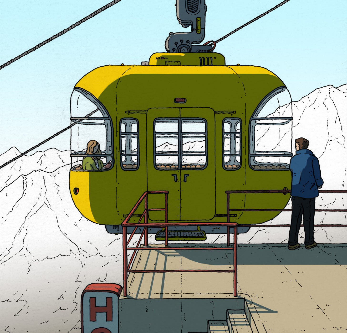
One of nicest compliments of my work is when people say some version of ‘I want to be there!’ or ‘I can just imagine what it would be like!’ This is a lovely thing to hear, as more often than not, that is exactly what I want people to think or feel. To achieve that connection, the space has to feel believable, which is not the same as accurate or even real. Indeed, one of my main motivations for making my science fiction book, The Hard Switch, was to see if I could make a completely alien world feel real, by bringing people in with human connectivity. I love lots of sci-fi, but I’m always more attracted to the lived in type rather than the big austere and clean ones, and I assume that is to do with my immersion. Can I imagine myself in that space?
As many of you will know, I used to be an architectural illustrator. During this stage of my career/life, my job was to sell the idea of a yet unrealised building or place, and as a result I learned a huge amount about what people connect with. I was going to do a list of things that help build up that believability, but it literally all boils down to one seemingly banal point; make it as specific as possible.
The frustrating paradox was that clients in the world of architecture thought that the opposite was true, and that a drawing should try to appeal to as many people as possible, but as a result, it appealed to no one. No one can really relate to a space that is not one thing or another. In a bid to not offend anyone, the result was often a very bland ‘nothing drawing’. Whether it was architects trying to sell it to the planners, or developers selling the dream to the eventual buyer, I got the same requests every time; go for the middle ground.
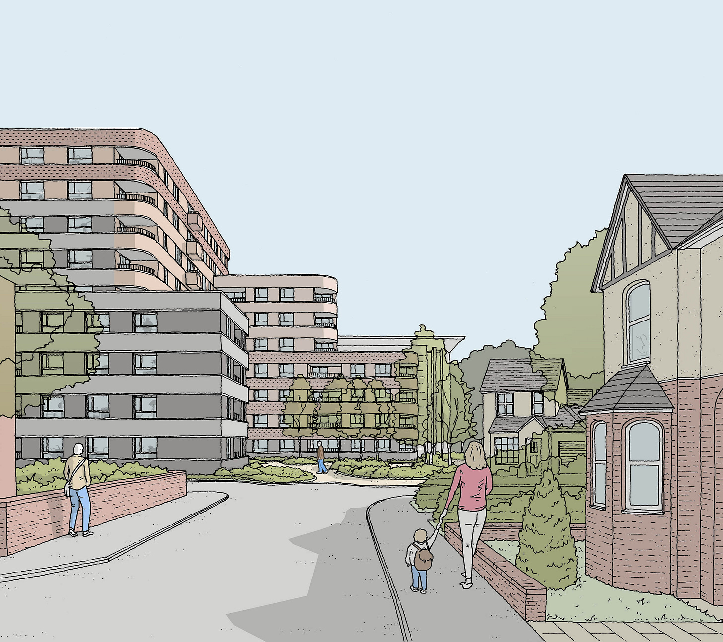
This drawing is bad. I can say that, becasue I did it, under careful client instruction. Instruction to make it a ‘non-specific time of day’, ‘non-specific weather’, ‘non-specific people’, ‘non-specific colour’, ‘non-specific trees’ etc, etc. It is the definition of the ‘middle ground’, and it was this phenomena (and some other contributing factors) that led to me eventually leaving the industry.
To be constantly engaged in shaving the edges off a drawing and creating ‘nowhere spaces’ was a frustrating experience. Not just for me, but the client always seemed slightly disappointed too. They would have commissioned me on the basis that I would deliver the same feeling they got when they looked at my uncompromised artworks, not realising that their constant requests to ‘lighten the shadows’ and such, were the very things that were eroding the drawing away to nothing.
But on the positive side, it made me focus on the spaces I did like to draw. Human, believable spaces. The spaces I would go on create in my books. And more importantly, the tricks to achieving them. So below are a few of many thoughts I have when drawing places that I thought you might find interesting.
Weather.
I was always asked by architectural clients to show buildings in the sunshine. Which in principle I get, but if you want people to want to be INSIDE your building, nothing makes that more appealing than making the weather outside inclement.
They always wanted it sunny, but again, not TOO sunny. Apparently those lovely deep blue, high summer, shadows would scare off anyone who had any emotion or memory.
Light / Time of Day.
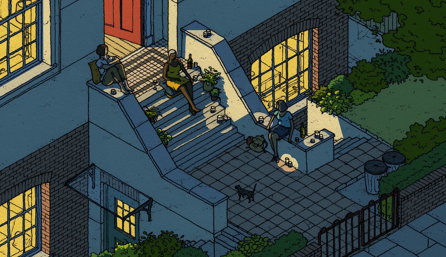
The request was frequently for well lit, daytime scenes, which again makes sense, but it’s hard to feel any strong associated emotion with it. Evening or night time brings with it its own feelings and relatability.
The same image below, lit for different times of day creates such a different feeling for each. The temperature of the apartment and the balcony shift, and as such, so do the intentions of the protagonist, thereby changing the mood of the whole composition.


People + Things.
I understand the wariness in adding human characters to a drawing as it shows the hand of the artist so much more than the background. As such, architectural clients would be fearful that the depiction of people would be too ‘cartoonish’, which in the UK is still unfortunately coded as ‘childish’. To avoid this, I would be asked to omit them, or just add a ghostly outline. Maybe it’s personal taste, but I find this more alienating than a person draw in a style that I don’t particularly like. Whatever the case, people do exist, and it turns out that people are people. And so, they relate to people. Once more for luck? People.
People have and like things. And those things say a lot about the person they are and the places they inhabit. To omit them is to miss out on a huge piece of narrative information.
Developers like to show clean, minimal places because they’re worried that potential buyers, when faced with a believably inhabited room, would think ‘That’s not how I live my life, how could I live there?!’ But people aren’t that stupid. They are much more likely to connect with the idea that SOMEBODY lives there, rather than an anonymous Bond villain.
Oblique Details.
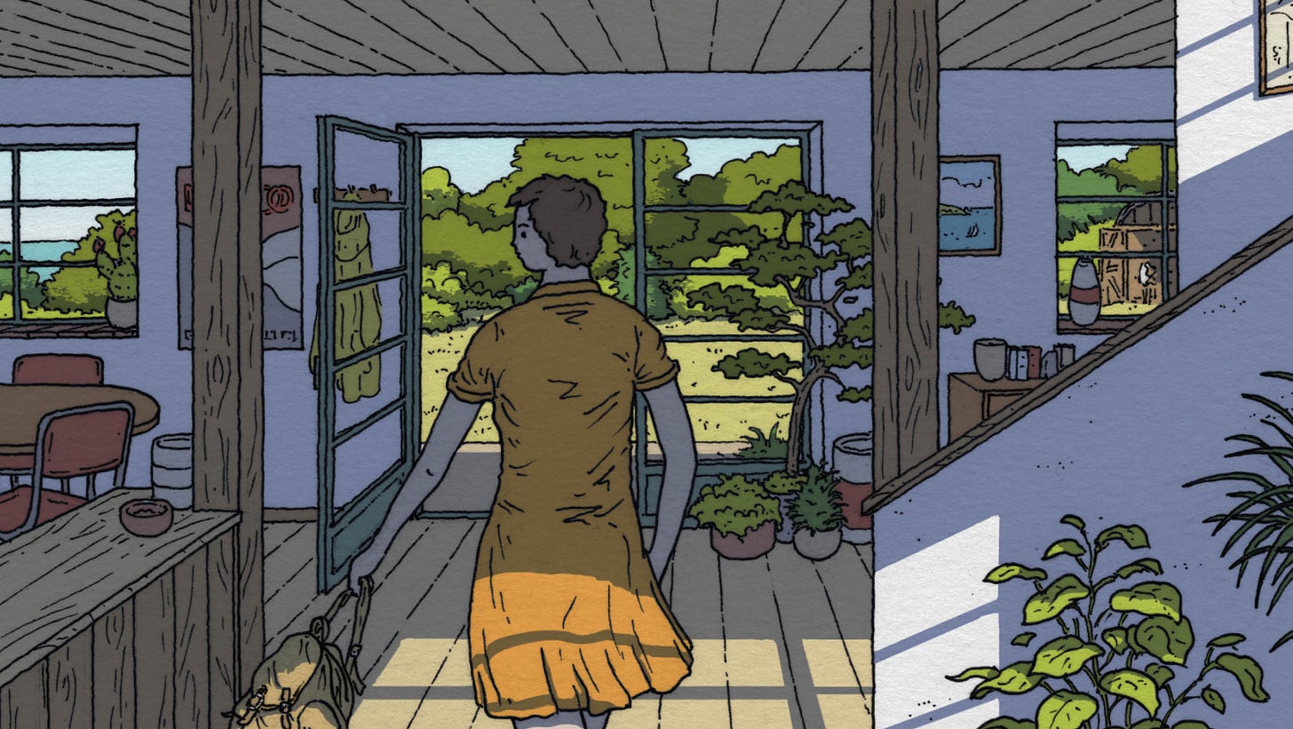
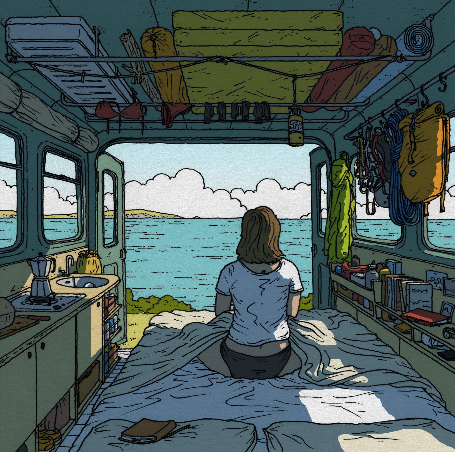
I think one of my favourite things in drawing is smuggle in some narrative details that in turn inform the viewer’s knowledge of the physical space, almost like mirror, allowing you to peer outside the frame.
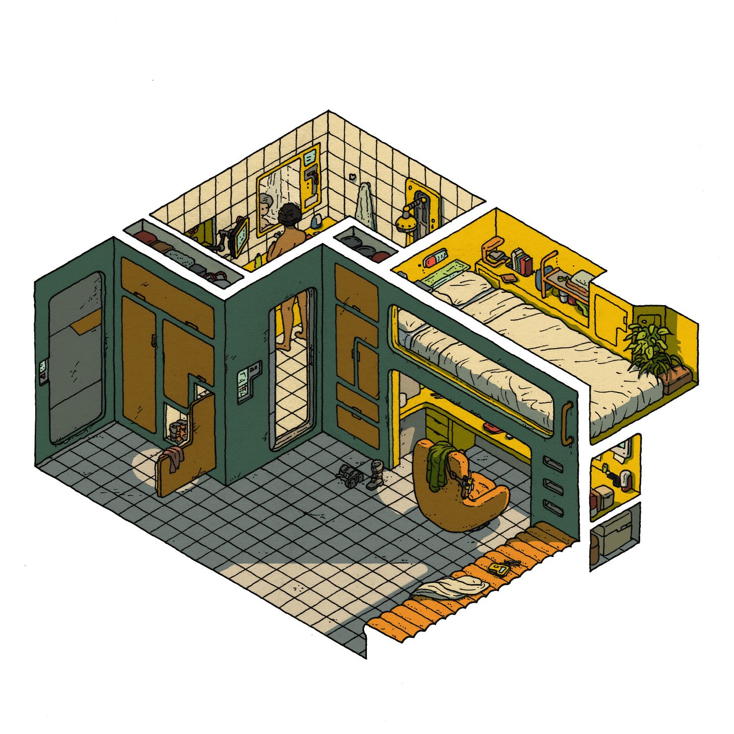
Here’s an example. This image is an interior viewpoint and there is very little visible of the outside world. But the characters are naked. This seems random at first, until we stop to consider the information we get form this fact. Firstly, it’s warm, and secondly, that it’s a remote location. Two things we could only have guessed at before. Maybe the open window would suggest some warmth, but there’s a very different temperature to shift from open window to getting undressed. The remoteness would have been complete speculation, as they could’ve easily been in a town or village, but without even thinking too much about it, we know that they are probably not.
The more you get into it, the more infinite the palette of these things to play with seems to be. And the ‘not thinking about it’ is kind of important too, as these things don’t need to be overtly signposted, the viewer should just ‘get it’. However strange or fictitious the location, they should just get that feeling of, ‘I know that place.’
I could literally ramble on about this forever, so you’d better head off before I bore you completely to death. Run, run for the hills! But do come back, I like our little chats, and I promise I’ll put the coffee on.
Owen D. Pomery.







This a really valuable perspective even for non visual artists. As an occasional songwriter I try to avoid describing a feeling but rather write about specific experiences that in turn evoke that feeling. It's usually much more effective than talking about love or grief or any other emotion directly, even if the listener hasn't had the exact same experience I'm describing.
Very clear and informativ text. Thanks for sharing this. I love your people and interiors. I like to draw people in context (as an hobby) but did not have background info like this. Appreciate this highly. Takes me further.