


Cover Story.
First impressions do count for something. And nothing, apparently.

Got any good books recently? Or perhaps you’re picking something off your own shelf to make space for an exciting new acquisition?
I won’t waste your time with the old ‘don’t judge a book by it’s cover’ adage, or even the more contemporary admission that of course we all judge books by their covers. In truth, both are misleading, because ‘judge’ and ‘choose’ seem to get used interchangeably, and no, we shouldn’t judge a book by it’s cover, but we most certainly do choose them that way.
So, once again we stand at a point where the waves of creativity crash against the cliffs of commerce. But it’s a new year, so let’s keep it light, shall we?
One of my favourite books I read last year was A Season in Sinji by J.L Carr. The edition I have I found in a charity shop, and it sat on my shelf for a long time before I got around to reading it. If I’m honest, one of the main reasons for this delay was the cover. Despite getting top marks for using illustration, it wasn’t exactly calling to me…
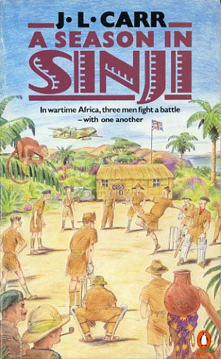
But I finally got past that and read it. When it came to finding a more suitable cover image for my ‘books of the year’ newsletter, I was struggling; as it seemed A Season in Sinji had been dealt a pretty bad hand over the years when it comes to cover design. In the end I opted for the most recent version, which although is not in any way exciting, was at least not too off-putting.
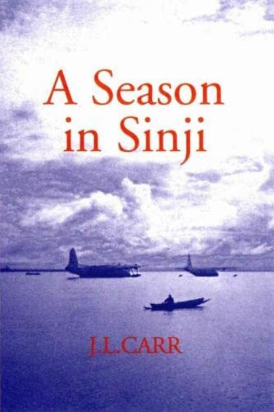
A bit more rummaging revealed a couple more. The original 1960’s release, which murkily does the job, but again is fairly uninspiring, and the weird (and almost spoiler-ish) 80s/90s edition, with its very representational illustration cover. Neither is great, but the book is set in WWII on an airbase in West Africa, so at least the planes/sea make some sense, however clunkily deployed.


However, the grand prize, the real gem of them all, was the following. I obviously don’t need to tell you it’s from the 70’s, but get a load of this…
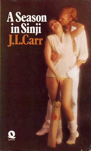
What the hell is going on here?!
Now, there is some cricket in the book (although I’m surprised how much this gets mentioned, with some calling it ‘a cricket novel’, whatever that is?), and there is also an element of unrequited love in the spectre of a largely absent character. But how the image above came to be, I have no idea. More intriguingly, it’s a photograph, which presumably means the person whole came up with it had to run the concept past someone else. Who, in turn, green lit a budget for him to get a photographer and the models needed to put his masterpiece together. No one at any point raised an objection.
When I picked up my copy, I was slightly concerned that it was a different J.L Carr to the one I had enjoyed reading in A Month in the Country, as the cover suggested something tonally quite different. Had I come across this 70s edition, I would have been absolutely sure it was merely an author of the same name, a J.L Carr who wrote softcore erotic cricket novels. Now, I’m not saying that wouldn’t have been fun, but that is literally the opposite of A Season in Sinji, which is an exploration of class, hypocrisy, colonialism and war.
I’m sure you’ve all seen you’re own examples over the years, and having some knowledge of how the world works means that we kind of know it must have come about by someone involved in marketing thinking ‘Hey, this book with a couple on the front is selling well, so lets stick a couple on the front of that old war book that isn’t shifting.’ Sometimes that works, even if people are a little miss sold, but in an example like this, I don’t think anyone gets what they want.
It seems although A Season in Sinji did not sell particularly well upon release and is still fairly unknown today. There’s a million reasons for why a book sells or doesn’t, but I can’t help thinking that this one didn’t have the best start in life.
I have a friend who is book cover designer (Robbie Porter, you should check him out) and after a book is released, he will often post all the iterations that were in the running. It’s a fascinating glimpse into the process. Whether you are familiar with the book or not, it’s wild how diverse the different ways the publisher has considered marketing it, and how easily your brain would bracket it as ‘one of those books’, depending on the route chosen. We all have our biases too. A matt yellow cover with a black and white photograph and nice font will get me every time, if you were wondering.
There’s plenty more to say about covers, particularly relating to the kind of books I make, where it’s expected that you will design/draw the cover too, which comes with a whole set of other questions. But let’s save that for another time, shall we? Hope your 2025 is off to a good start, and if it’s mediocre start, that’s okay too. One day at a time, and I’ll see you for a coffee soon.
The only thing left to tell you is that my new graphic novel will be called ‘Three Wickets Up’ and will be a powerful work of cricketing erotica, if that’s not an oxymoron. I just need to read up on the rules of cricket. And erotica.
Owen D. Pomery.

sign me up for a copy of ‘Three Wickets Up’ when it's out
I’d like to see your version of a cover for that book.